1. Initiative Overview: A Voluntary Pilot Renovation
Description:
This initiative represents a voluntary, non-profit endeavor to renovate a selected wing of the Jordan Museum. Its purpose is to elevate the curatorial, preservational, and exhibition standards of the institution, providing a pilot model for systematic, incremental enhancement of the museum’s collections. The project is conceived and executed by a dedicated consortium of volunteers with specialized expertise in art curation, photography, graphic design, research, writing, interior design, and art direction, ensuring adherence to international museum standards.
Core Principles:
• Pilot-focused intervention to demonstrate potential improvements without requiring extensive upfront capital.
• Volunteer-led execution to maximize impact while minimizing costs.
• Full alignment with professional standards of artifact preservation and museology.
2. Strategic Intention
Rationale:
The Jordan Museum, as the nation’s premier repository of cultural and archaeological heritage, currently faces structural and operational limitations, including constrained funding and insufficient specialist staff. This initiative seeks to address these gaps through a carefully designed pilot renovation, intended to:
• Demonstrate the potential for elevated exhibition standards through meticulous art direction and curation.
• Engage stakeholders—governmental, institutional, and philanthropic—by illustrating the feasibility and impact of professional interventions.
• Catalyze incremental investment to enable staged, sustainable development across multiple wings of the museum.
This approach underscores the museum’s capacity to present Jordanian heritage with rigor, sophistication, and international visibility, fostering both public engagement and institutional credibility.
3. Campaign Concept & Scope
Overview:
The campaign is conceived as the operational framework for this pilot initiative. While Philadelphia (ancient Amman) may serve as a prototype, the methodology is universally applicable to other wings or collections.
Components:
• Professional Catalog Production: Comprehensive documentation of the selected wing’s artifacts, including historical context, curatorial notes, and high-quality visual representation.
• Curated Storytelling & Narrative Design: Clear articulation of artifact significance to engage both scholarly and general audiences.
• Exhibition Enhancement: Strategic arrangement of artifacts to highlight historical, artistic, and cultural narratives.
• Pilot Event (Optional): Launch to engage stakeholders, showcase improvements, and communicate the initiative’s impact.
4. Physical Renovation & Display Enhancements
Scope of Work:
The pilot wing will undergo targeted, high-impact interventions designed to maximize visual and educational impact while respecting existing infrastructure and budgetary constraints.
• Display Optimization: Cleaning, minor adjustments, and aesthetic refinements of existing cases and surfaces.
• Lighting Enhancement: Optimization of existing fixtures to illuminate artifacts without compromising preservation.
• Artifact Placement: Thoughtful spatial arrangement to enhance narrative coherence and visitor experience.
• Non-Invasive Methods: All interventions are fully reversible and preserve artifact integrity.
5. Voluntary Services & Professional Contributions
Scope of Contributions:
The initiative will fully provide, on a voluntary basis, all scholarly, creative, and curatorial services necessary for the pilot renovation:
• Art Direction & Curation: Expert guidance in layout, thematic development, and artifact interpretation.
• Photography & Documentation: High-resolution imagery for cataloging and display.
• Graphic Design: Design of exhibition labels, signage, and catalog layout.
• Research & Writing: Historical and cultural contextualization of artifacts and interpretive material.
• Interior Design Consultation: Professional assessment of spatial organization and display optimization.
Deliverables:
• Professionally curated and documented wing.
• Comprehensive catalog with artifact photography, historical context, and curatorial insight.
• Visual and narrative alignment of artifacts with interpretive storytelling.
Note: All costs related to physical display materials, case replacements, spotlights, printed catalogs, or event hosting are outside the scope of volunteer contribution.
6. Strategic Outcome: Awareness & Incremental Development
Vision:
This pilot initiative is intended as a proof of concept, demonstrating the Jordan Museum’s potential for elevated curatorial standards. By showcasing tangible improvements in one wing, the project seeks to:
• Raise awareness among key stakeholders, including representatives from the Ministry of Tourism and Antiquities, UNESCO, and relevant cultural institutions.
• Establish the museum as a model of professional excellence in the presentation of Jordanian archaeological and cultural heritage.
• Enable incremental, stage-based funding for the development of additional wings, facilitating a systematic, sustainable enhancement of the museum.
Strategic Note: The initiative is not contingent upon initial external funding; rather, it functions to illustrate feasibility, inspire support, and catalyze future investment across the institution.
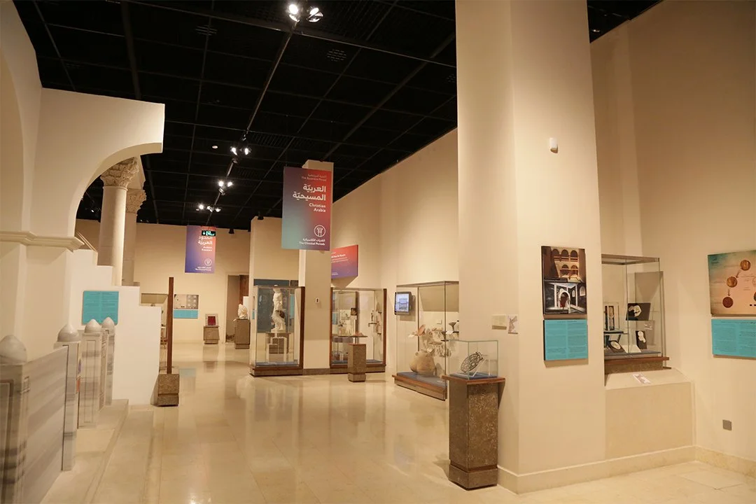
Who We Are
Based on a critical design and visitor experience perspective, here is a detailed breakdown of the issues in this museum room, organized from top to bottom and ranging from small details to major structural problems.
1. The Ceiling & Lighting (The Top)
• The "Black Void" Ceiling: The aggressive industrial open-grid ceiling completely clashes with the attempt at classical architecture (the arches and pillars below). It breaks the immersion. Instead of feeling like a historical space, it feels like a warehouse or a trade show.
• Visual Clutter: The ceiling is messy. You can see HVAC vents, tracks, wires, and structural beams. This draws the eye upward and away from the exhibits.
• Lighting Glare: The track lighting is positioned in a way that creates significant glare on the glass display cases. If you look at the case in the center-right, the reflection of the room is clearer than the artifacts inside. This makes viewing difficult and tiring for the eyes.
• Uneven Illumination: The lighting creates harsh pools of light on the floor (hotspots) while leaving other areas (like the upper walls) in gloomy shadow. This high-contrast lighting can be disorienting.
2. Signage & Information (Eye Level)
• Hanging Banners feel "Temporary": The banners hanging from the ceiling (e.g., "Christian Arabia") look like temporary conference signage rather than permanent museum curation. They block sightlines to the back of the room and make the space feel cluttered.
• Color Clashing: The color palette is confused. You have gradient orange/purple banners, bright teal/cyan wall text panels, and warm cream walls. The teal panels specifically are jarring and feel arguably too "modern" or "corporate" for an exhibit about classical history.
• Text Panel Placement:
• Inconsistency: Some text panels are mounted on the walls, while others are on the sides of cases.
• Height Issues: The panel on the far left stair wall looks placed somewhat arbitrarily, perhaps too low for a comfortable read for a standing adult, or visually disconnected from the object it describes.
• Smallest Annoyance: The small white sensor/device (likely a motion detector or Wi-Fi point) stuck on the massive right-hand pillar is an eyesore. It disrupts the clean line of the column.
3. Display Cases & Layout (The Middle)
• Dated Case Design: The display cases have heavy, thick wooden/metal bases and frames. Modern museum design tends to favor "frameless" glass or floating displays to make the artifact the hero. Here, the furniture feels heavy and old-fashioned.
• The "Fishbowl" Effect: Because the cases are scattered in the middle of the floor with glass on all sides, they are visually noisy. When you look at an object, you see the rest of the room through the glass behind it. There are no opaque backdrops inside the cases to isolate the artifacts.
• Confusing Flow: There is no clear path. The room feels like a corridor with obstacles (cases) scattered randomly. Does the visitor go left? Right? The layout doesn't intuitively guide you through a narrative.
4. Architecture & Structure (The Biggest Issues)
• The Massive Pillar: The huge rectangular column on the right is the single biggest spatial flaw. It creates a massive blind spot, creates a "pinch point" in the hallway, and dominates the room, making the artifacts next to it look tiny and insignificant.
• Faux Architecture: The white archway and stairs on the left look like a stage set or gypsum board construction rather than part of the building. It feels slightly hollow and disconnected from the dark industrial ceiling above.
• Scale Mismatch: The room is very tall, but the artifacts are small. The volume of the room swallows the exhibits, making the collection feel sparse.
5. The Floor (The Bottom)
• High-Gloss Reflection: The floor is highly polished stone. While it looks clean, it acts like a mirror. It reflects the messy ceiling grid and the bright lights, doubling the visual clutter.
• Cold Atmosphere: The combination of the hard stone floor, vast white walls, and industrial ceiling makes the space feel acoustically "echoey" and cold, rather than intimate and inviting.